我们围绕着业务、市场、用户三个维度,为品牌构建符合趋势、用户喜欢的互联网产品。
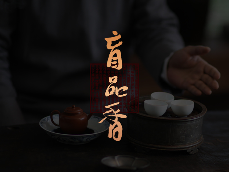
微信小程序、产品包装设计

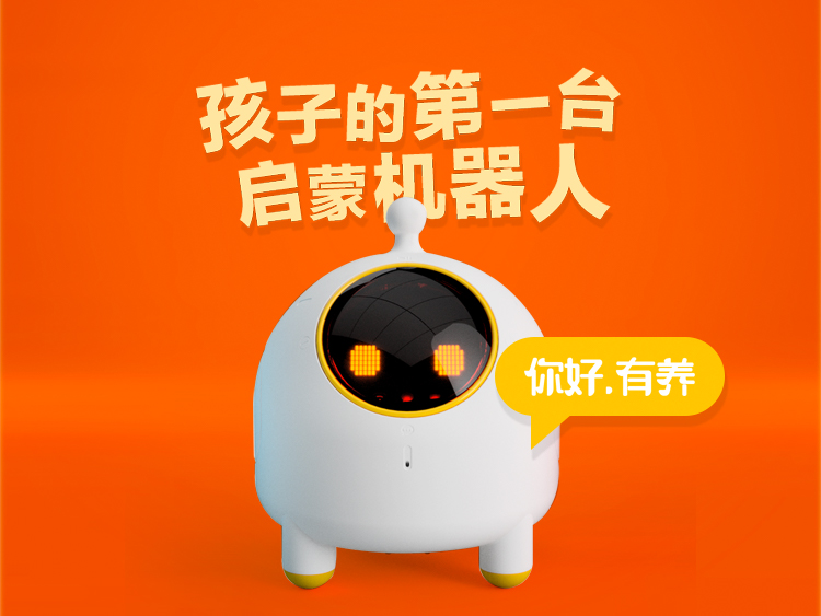
APP设计、用户体验优化
营销页面、宝贝页设计
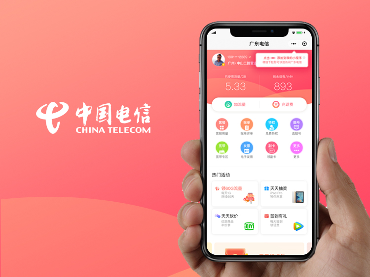
微信小程序、用户体验优化
logo设计

APP设计
用户体验优化、专题设计
官网设计、响应式网站设计
官网设计
深入业务核心,利用丰富的行业通理及产品经验为品牌提供行之有效的服务。
品牌官网
响应式网站
电子商务网站
营销型网站
iOS/Android界面设计
微信小程序
手机商城
HTML5设计开发
用户分析
UI/UE标准制定
转化率/活跃度提升
交互流程优化
LOGO标志设计
平面设计
VI设计
包装设计
我们用创意为客户创造价值,为他们实现用户体验上的突破。


邮箱:nick@offidea.com
广州市越秀区东风东路东宝大厦